How a Website Redesign Made Getting Covered Simple for Majestic Insurance
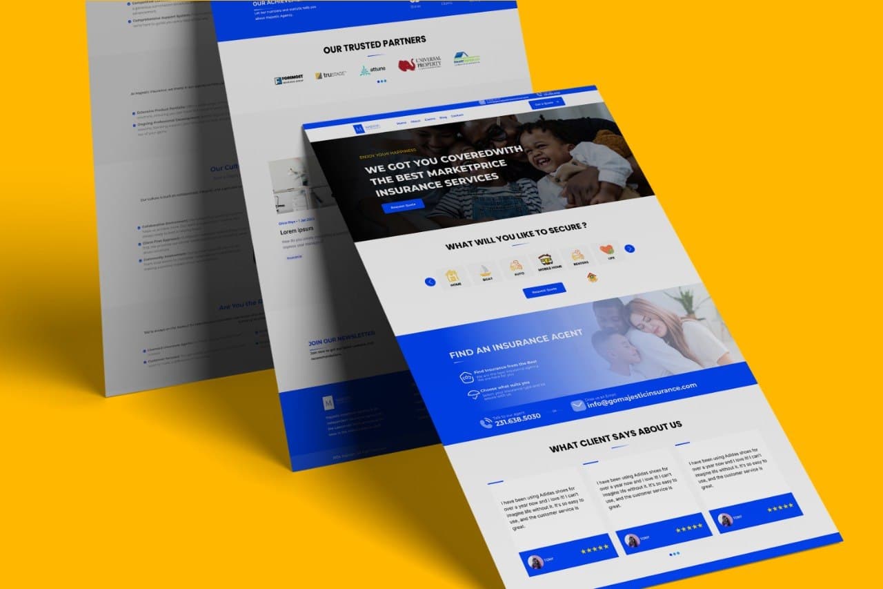
Majestic Insurance is a real Web&Buzz client, not a hypothetical example. They're an independent agency writing Auto, Home, Business, Life, Watercraft, Mobile Home, and Renters coverage, and their site is a good illustration of a problem a lot of service businesses have: the business itself works fine, but the website is what's getting in the way.
The Problem
Before the redesign, visitors to Majestic Insurance's site couldn't quickly find how to get a quote, file a claim, or reach an agent directly. For an independent agency writing seven different types of coverage, that's not a small gap, a visitor looking for boat insurance and one looking to file a claim on their home policy need to land in completely different places, fast.
The Redesign
The rebuild organizes the site around three things: choosing the type of coverage you need, connecting with a local agent, and getting protected. Filing a claim, previously buried, now has its own dedicated place in the main navigation, right next to getting a quote. Nothing about the redesign was about looking more “modern” for its own sake, every structural decision traced back to making those paths faster for someone who just wants coverage, not a design tour.
The Result
Getting covered through Majestic Insurance now feels simple instead of confusing, and there's a faster path from someone landing on the site to actually becoming a policyholder. It's also backed up by how clients actually describe working with the agency: reviews on their own site consistently mention same-day response on claims and personalized help finding the right policy, the exact promise the redesign was built to get out of the way of. View the live site.
The Pattern Behind It
This is the same question worth asking about any small business site: is there one clear, obvious action you want a visitor to take, and can they find it in the first few seconds? If the honest answer is no, that's usually the actual problem, and it's rarely fixed by a fresh coat of paint alone.
Is your site making it hard to do business with you?
Book a free strategy call and we'll walk through what's actually slowing visitors down, and what a redesign would fix.